

a case study
Wellness App
 Back
BackAt a Glance

My Role
Lead Designer and Researcher

Project Length
Six (6) Months

# of Iterations
Three (3) Iterations
We Have a Problem
It’s a nationwide problem that persists for millions of people in this country, affordable + reliable healthcare coverage. Statistics show that many Americans either cannot afford to maintain yearly health insurance or they have a plan that is confusing to understand. These issues leave over 80 million people scratching their heads and ultimately vulnerable to the elements.

Project Overview
Fixing healthcare is a big undertaking for any one company but our team was tasked with focusing on making improvements in how people navigate their healthcare coverage. The prompt was “How can we educate and support people in effectively utilizing their healthcare coverage?”
Target Audience
This healthcare app is digital, it relies on knowledge of using a smartphone, requires trust in technology, and would provide value for people with insurance. Based on my research and limited resources, I anticipated our audience would likely resemble the following demographic:
- Ages: 26 - 45
- Technologically inclined
- Low to Mid Income
- Female consumers
- Frequent healthcare consumers
These types of users are more likely to consider breaking the paradigm of booking and completing healthcare services. We know from our surveys that people often discover new doctors through referrals from family, friends, and current medical professionals. Contrary to that trend, Zocdoc’s (a direct competitor) search platform has contributed to breaking that paradigm paving the way for future healthcare companies that rely on online searches and reviews.
Design Sprint
Research & Competitive Analysis
User Surveys & Insights
User Pain Points
Wireframe & Prototype
User Testing
New UI & Solutions
Research
As a designer-of-1 on this project working for an early startup meant being very intentional about the steps I took in this product design journey. Time and resources were valuable both for me and the company. Therefore, I approached research in the following ways.
- Reading about healthcare, health insurance, and finding competitors
- Studying health insurance plans
- Observing comments from people online about their experiences
- Using Hotjar to push survey questions and validate what I’ve learned
- Analyzing my research and coming up with theories
Early Prototype
The first iteration of screens was simplistic, designed with the expectations that significant changes would be needed. My approach was to test early because real human feedback was incredibly important to myself (professionally) and for the success of this product.
User Testing
Using the early prototype I conducted user tests with 10 participants ranging in age from 24-55, males, and females. Interviews were recorded for analysis. Participants were prompted to do the following:
- Enter provided insurance details
- Express their first impression of the visuals.
- Observe and report their understanding of health coverage
The early prototype was a request by the company and was used to validate ideas and assess user needs and pain points. Apart from testing, I used open-ended questions to understand the lived experiences of participants navigating the world of healthcare.
Pain Points

Costs
Will I have more fees?

Providers
Which provider is best for my insurance plan?

Confusion
What's a deductible?
Solutions and Features
In the second iteration, the following features were selected to solve our user’s challenges (i.e. visual graph, search functionality, a digital insurance card, and a cost estimator). These solutions will then be tested and data will be analyzed over a set amount of time.
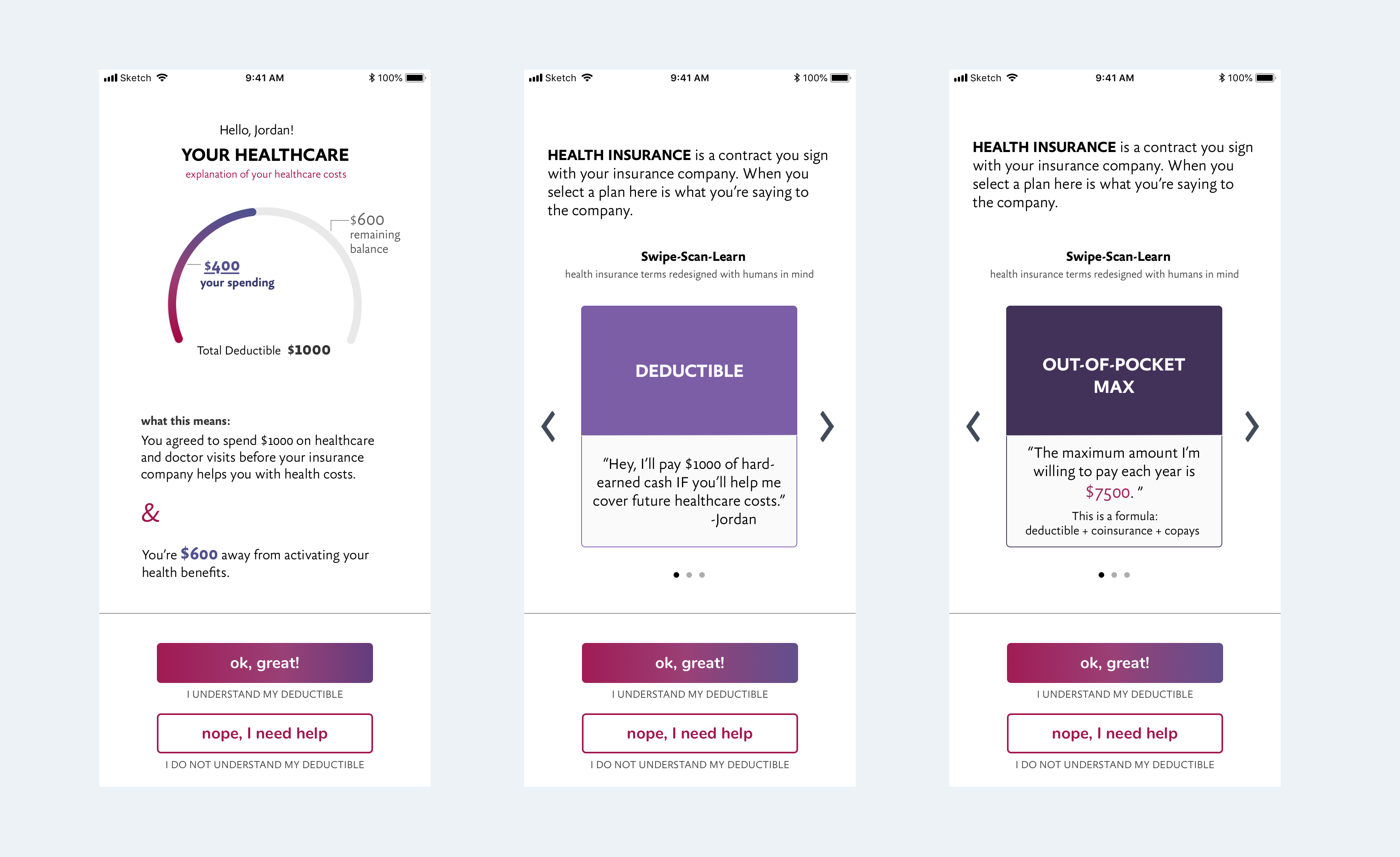
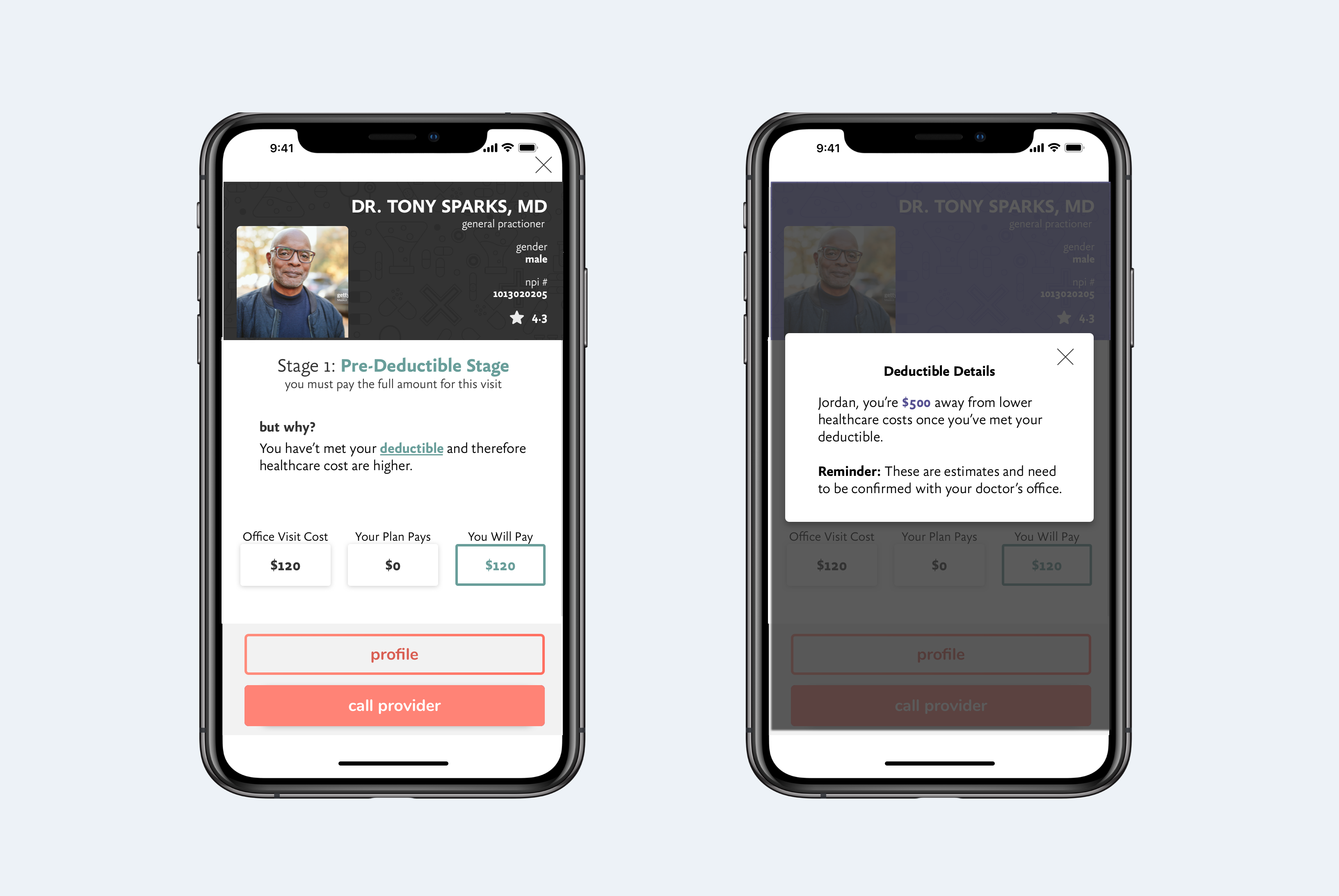
Visual Graph
Right away the user can see how much they have spent towards their deductible and an explanation of what that means.
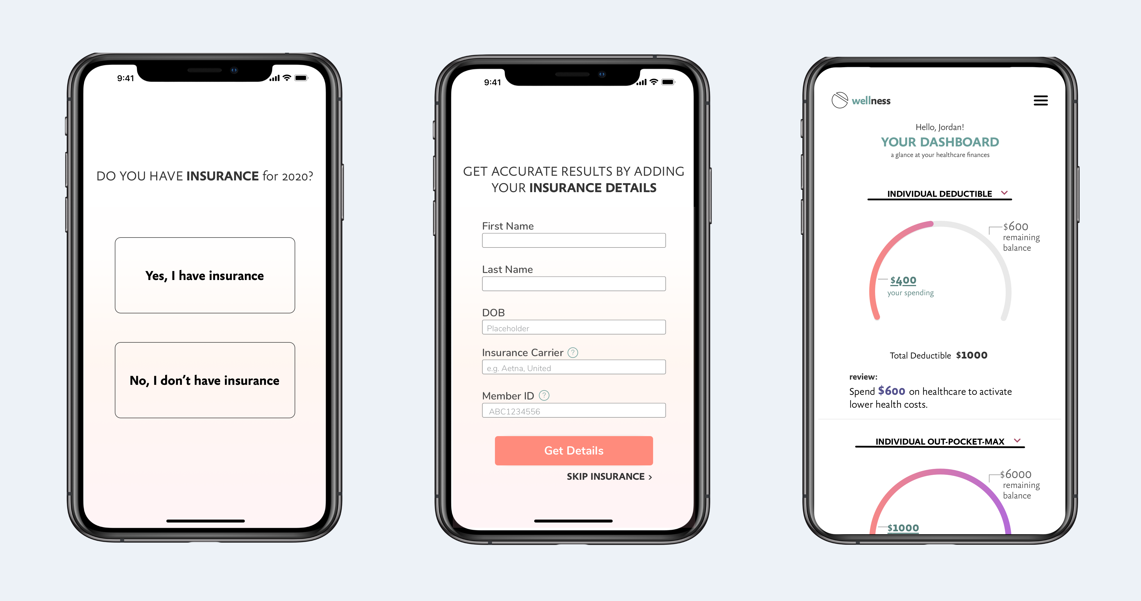
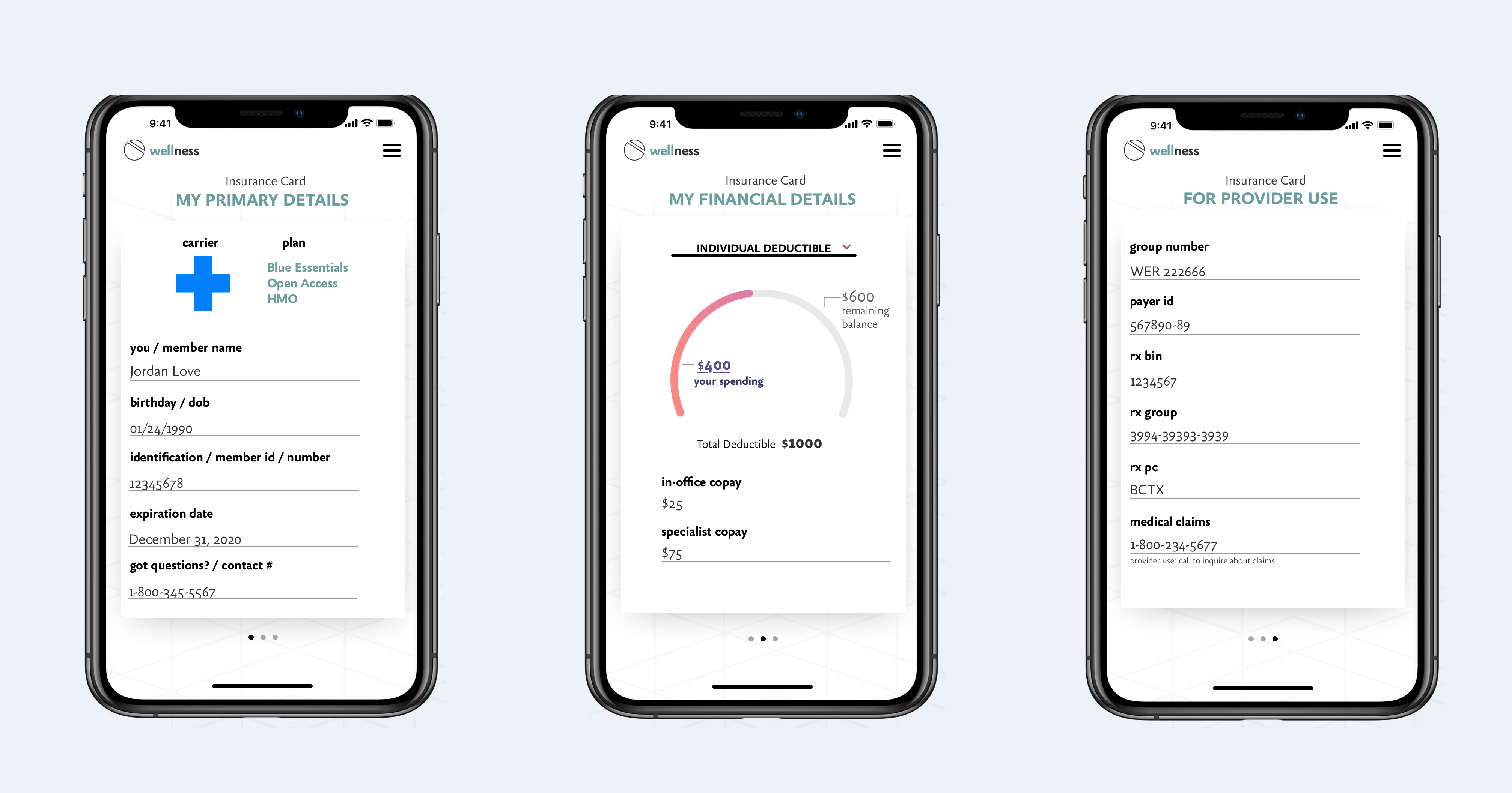
Digital Insurance Card
Cellphones hold most of our important information and we tend to keep our device close, so why not have access to your digital insurance card from your phone? There are 3 views categorized by need (i.e., personal details, financials, provider details).
Search
The search functionality was designed to be quick by adding a drop-down and search bar. Our users can also search by clicking a service-specific hot button. The results would sort by relevance to location and insurance coverage.
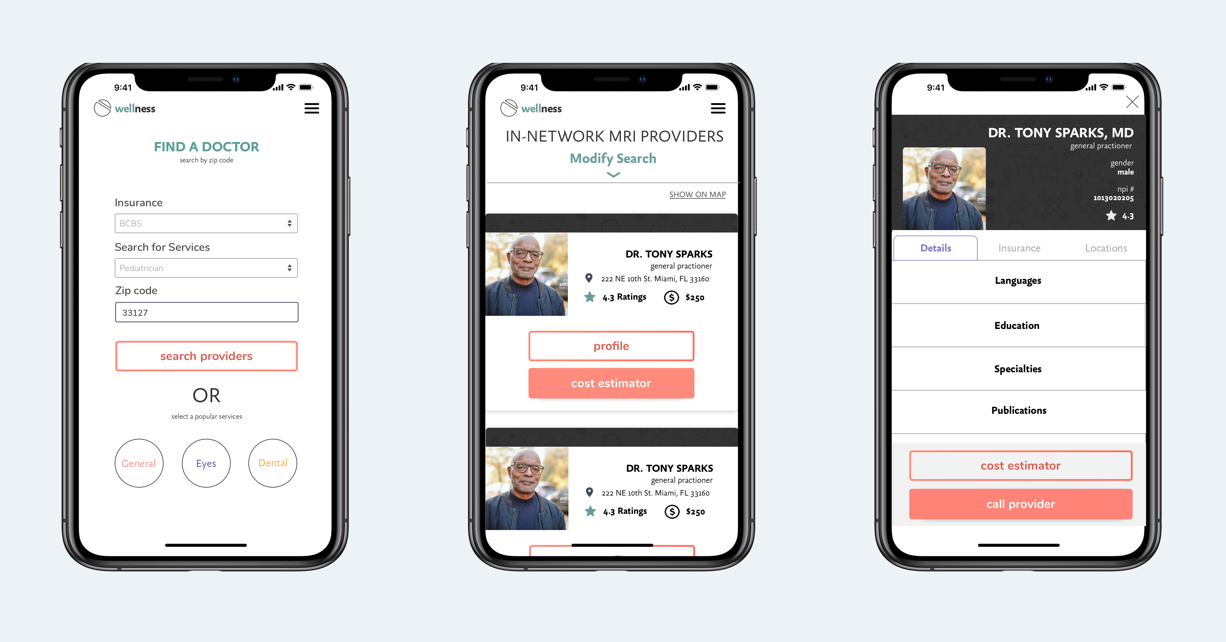
Cost Estimator
The most prominent feature is the ability to estimate (only an estimate) the cost of the doctor visit. This feature speaks to the user’s desire to not only know ahead but to plan their expenses just as they would in other shopping experiences.
Summary
The product reached the stage of development in December 2019. It’s built with vue.js on the frontend and PHP on the backend. Multiple APIs were required to create the functionality of the design. Currently, there are some roadblocks.
- There are hundreds of insurance carriers with varying plan types and data structures
- Accurate cost estimates require cost insight from the provider
- Booking functionality also requires provider participation
This is an early-stage product built at an early stage startup so the room for improvement is great. However, the product’s goals and intentions are wholesome and promising. My recommendation post-launch was to build a team of designers and developers to better match the needs of future product development and to continue research and branding.
Personal Roadblock
As an empath, healer, and designer of solutions, I am simply not satisfied with the current iteration of the product. I’m glad we could add features that assist people in their time of need and in some cases most vulnerable moments. However, there is more to be achieved here.
Displaying visual graphs of a user’s health expenditures is not the same as Credit Karma showing increased credit scores or gaining membership points for free collectibles at your favorite department store. An increase in health spending often correlates with an increase in health challenges.
Where is the validation and delightfulness in that? Personally and professionally, I believe there’s more value in showing users how to “milk” their insurance for all its got. Examples:
- Inform users of all the free services that come packaged in their coverage
- Provide maps, suggestions, and referrals to specific locations and doctors
- Reduce hesitation to act by displaying money lost if they choose to not use their coverage.
- Include a health profile that estimates the amount of coverage they need for next year
- Help users form healthier habits
To really know me, embrace a little wabi-sabi
Caribbean-made with global ambitions.
Diverse perspectives welcomed.
Holistic problem solver.
Interested? Then let’s collaborate!